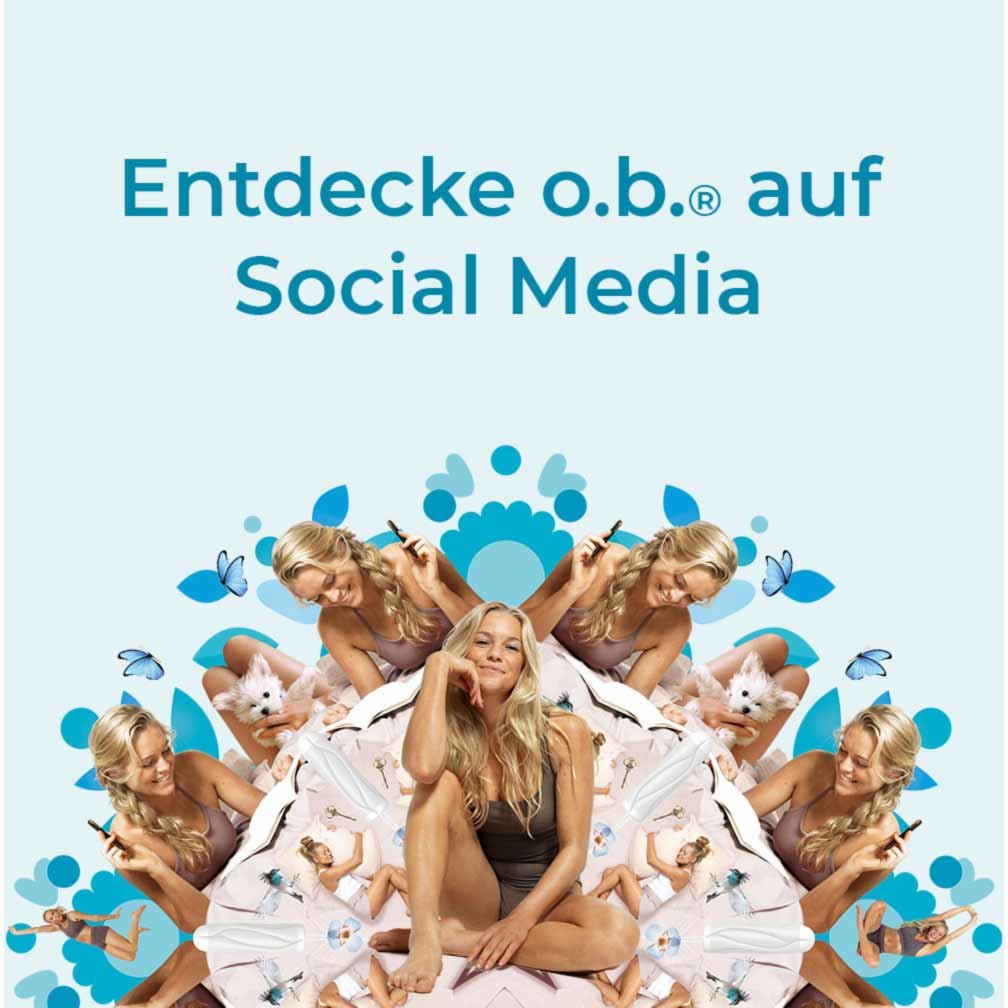
o.b. Brand Refresh
Packaging Refresh • Agency Oversight • CGI Direction • Color Strategy • Illustration • Icon Development • Global Packaging Guidelines • Regional Rollout Oversight

Revolutionize a commodity to a women’s health lifestyle brand
Launched winning design concepts for o.b. tampons, maintaining the #1 tampon brand choice in EMEA regardless of new competitive brands.
In 2016, we modernized the brand, reinventing the floral imagery typical in the FemCare aisle and elevating the ownable circular brand equity, mimicking the existing logo.
In 2019, we strengthened the core o.b. equities, reframed messaging, and gained relevance with Gen-Z consumers. Conveyed a sense of natural through the graphics, creating a design system across the portfolio. Tapped into consumer trends, focusing on ingredient transparency, by launching all white cartons across the portfolio— emphasizing free-of while also launching an organic cotton SKU.


2016 Packaging Refresh


Final Design
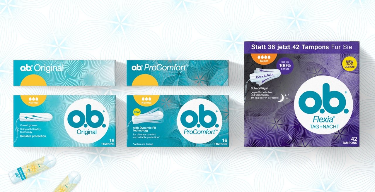
2019 Packaging Refresh

Fresh, Dynamic & Fun
Infused more playfulness and freedom of expression to appeal to younger consumers while maintaining existing design equities.
Additional design outcomes increased the ease of consumer navigation, allowed seamless introduction of new innovations (i.e. Organic), and addressed market trends demanding transparency, authenticity, and purpose.


2017 Limited Edition
Showcase the o.b. “do-er spirit” that’s part of the brand DNA and brand campaign (at the time). Aim for category entrants, core target age 15-19 years old, wider audience 15-25 years. Oversaw and directed work with Dragon Rouge Agency.

Final Concept


Creative Team
Creative Director: Paul Owen
Design Director: Jennifer Dahl
Design Lead: Melinda Brechbuehler
Senior Designer: Alyssa Lagattuta
Packaging Production: Oddesius Perry