REBRAND & PACKAGING
From Skin-Renewal to Self-Renewal.
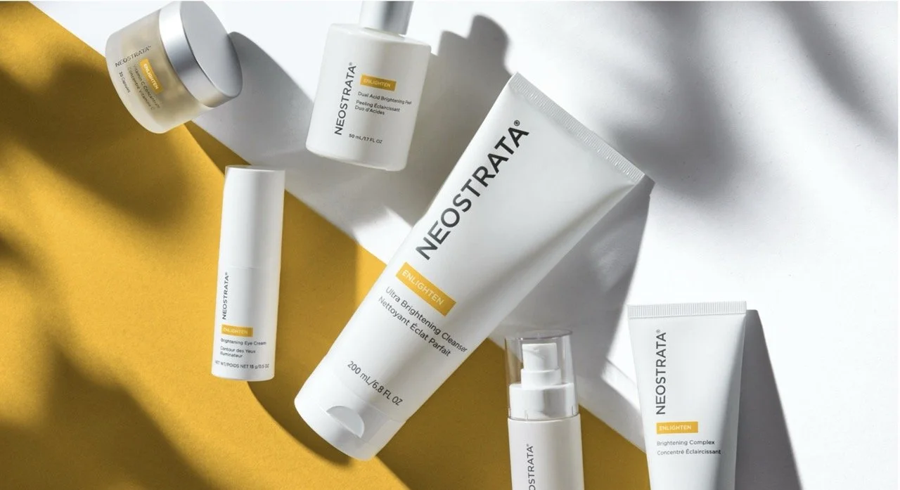
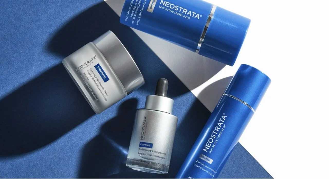
Neostrata, meaning ‘new layers,’ reflects the brand’s belief that skin renewal delivers visible results. Rooted in science and founded by two chemists, Neostrata’s refreshed identity draws from the lab, merging clinical precision with beauty. The updated logo mimics molecules, while packaging patterns symbolize skin regeneration, honoring the brand’s legacy of innovation and high-performance formulations.
Concept Development, Packaging Design, Brand Identity & Logo, Cross-Functional Collaboration, POS materials, Conference Design Assets
Beyond skin renewal
Because skin is so critical to how we see ourselves and connect to world, Neostrata recognizes the power of skin renewal to elevate both appearance and self-esteem. That’s why, as pioneers in skin renewal research we are committed to continuing to drive innovation and proven solutions that help women achieve both skin-renewal and self-renewal.
Brand Strategy
Skin Renewal to Self Renewal. The power of skin renewal to elevate both appearance and self-esteem.
Early Concepts
Design Objective: Build beyond the category conventions to create a more evocative, emotional, and engaging expression for Neostrata. Adding new dimensions to enrich the brand with a personality that differentiates.
A Winning Design
Activation
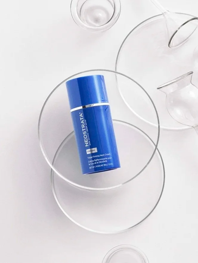
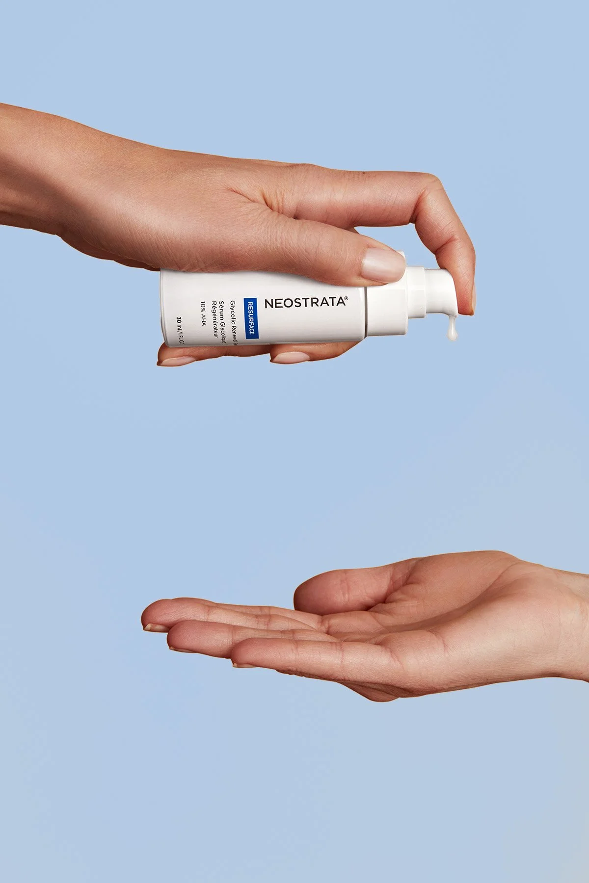
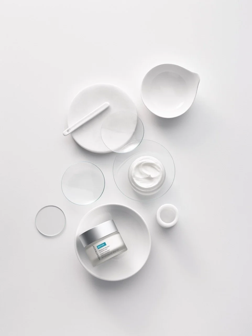
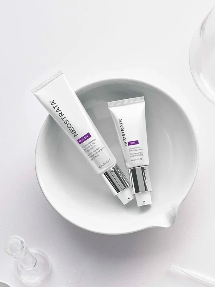
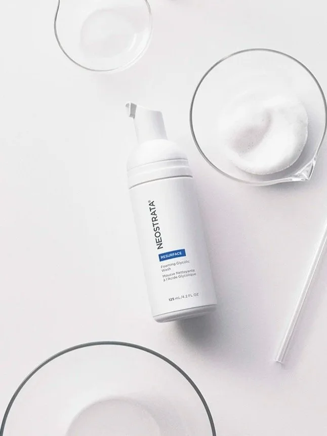
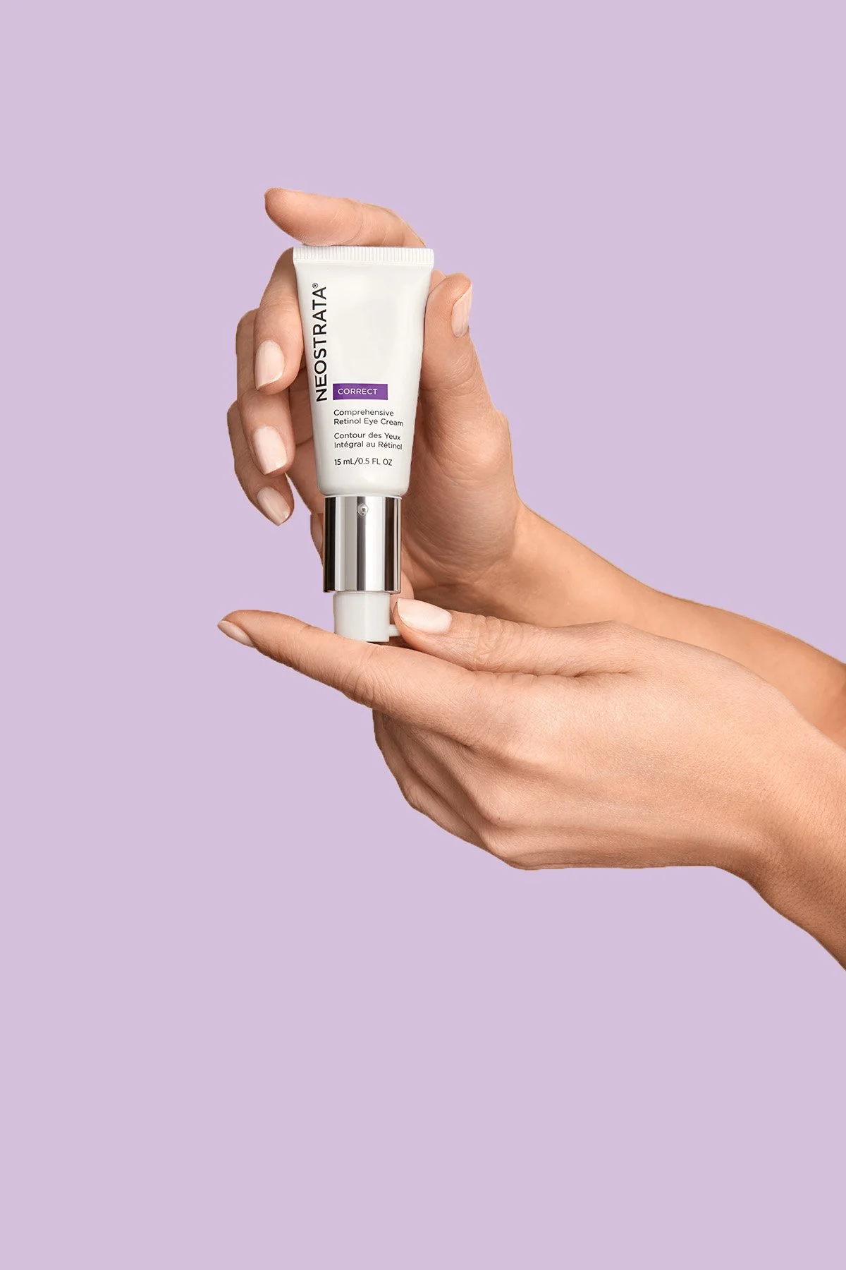
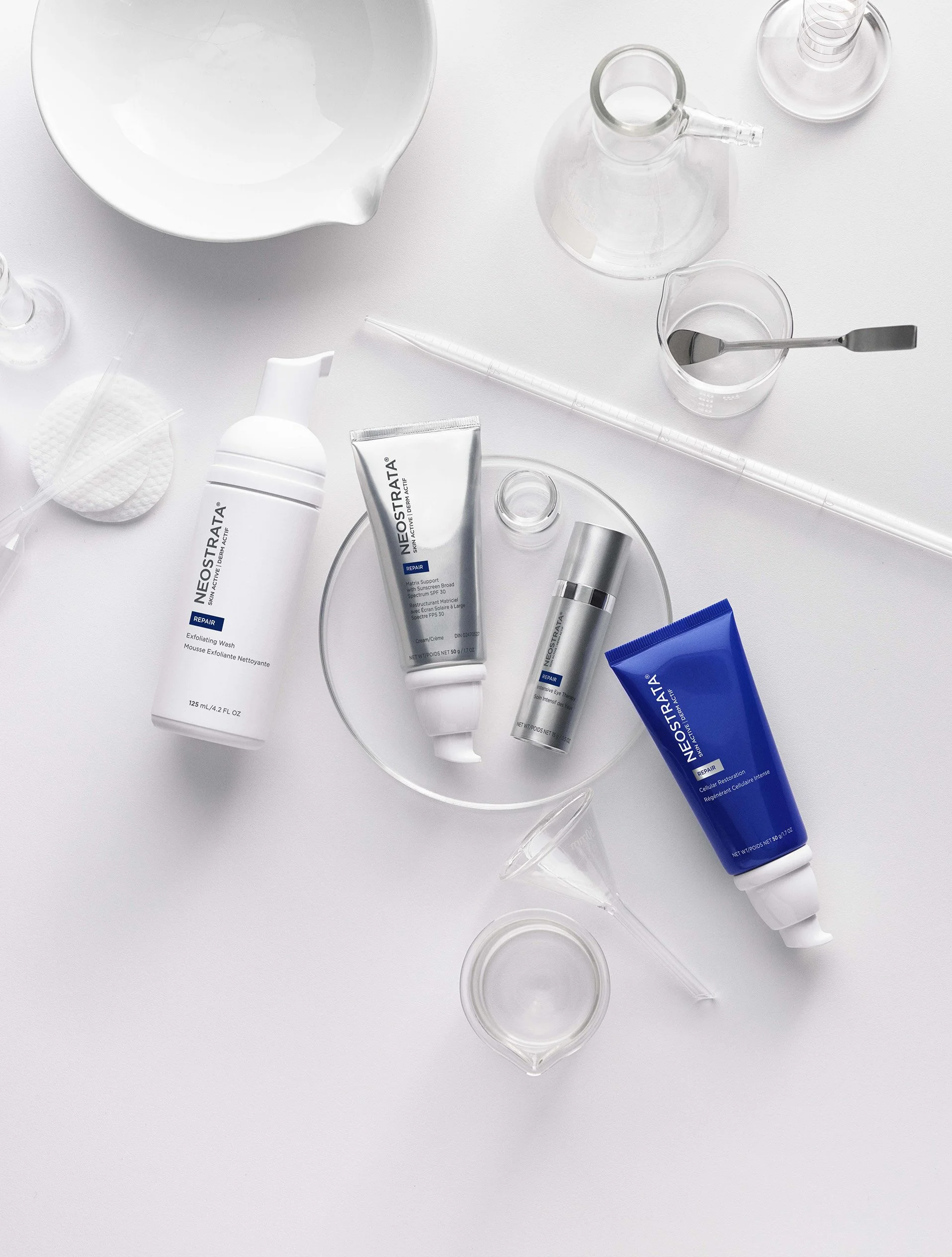
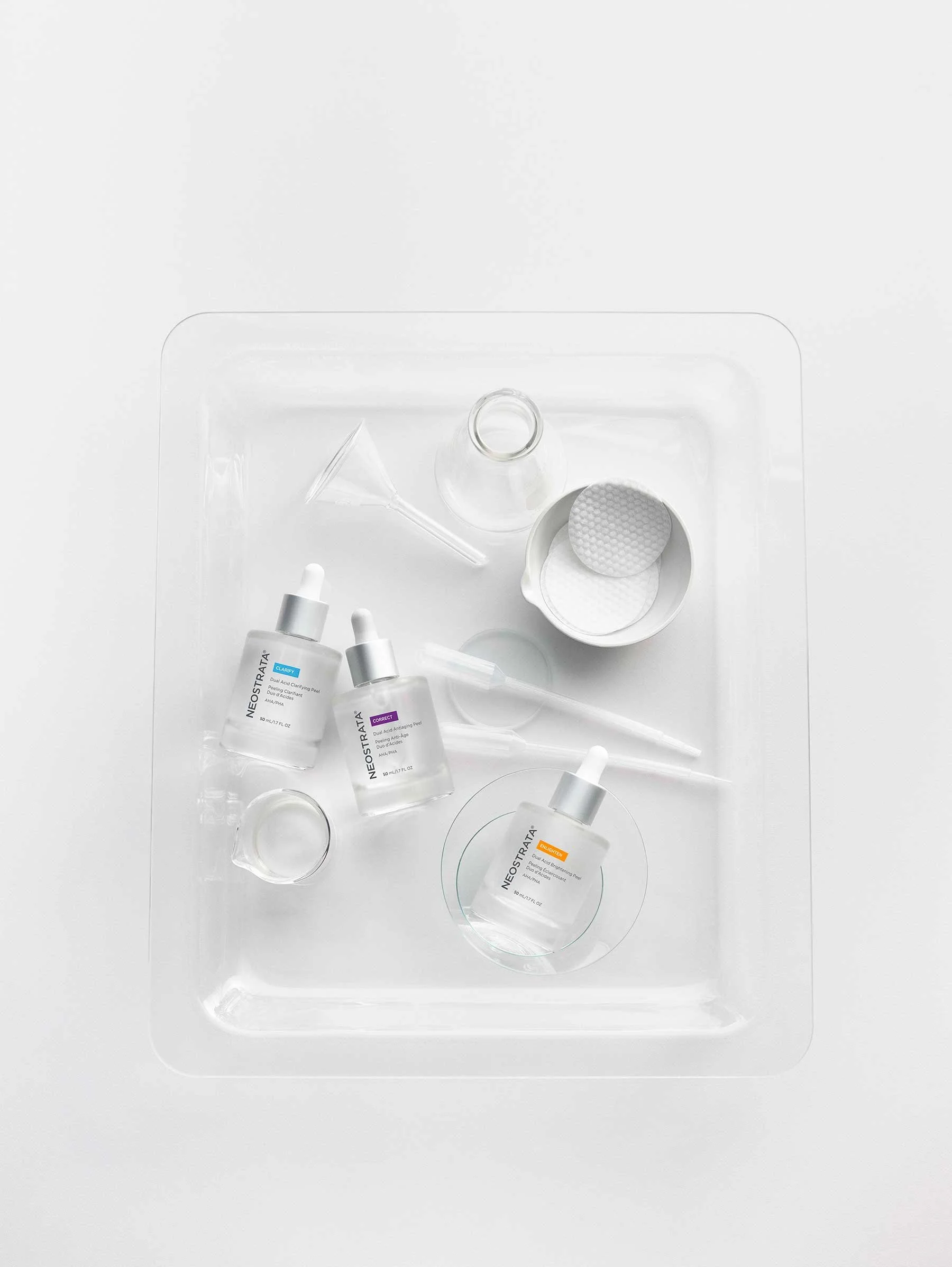
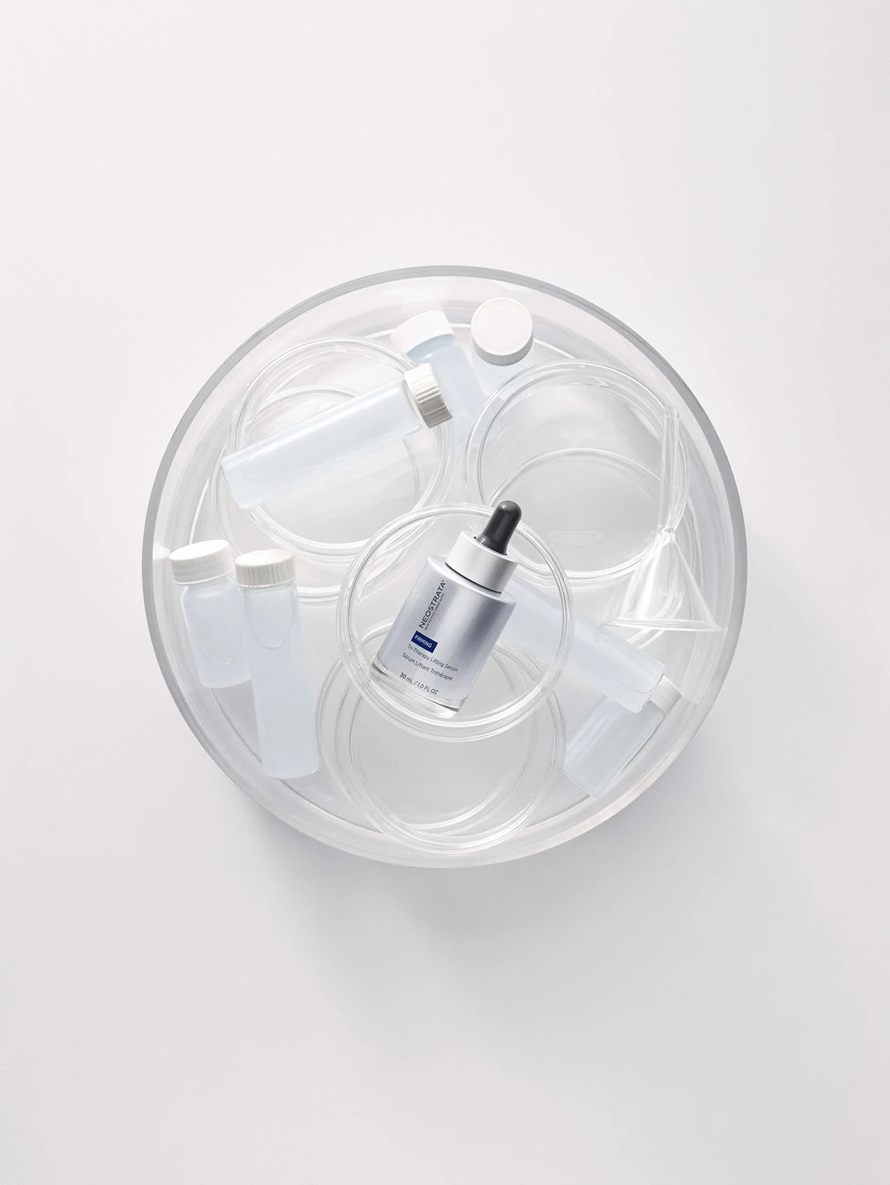
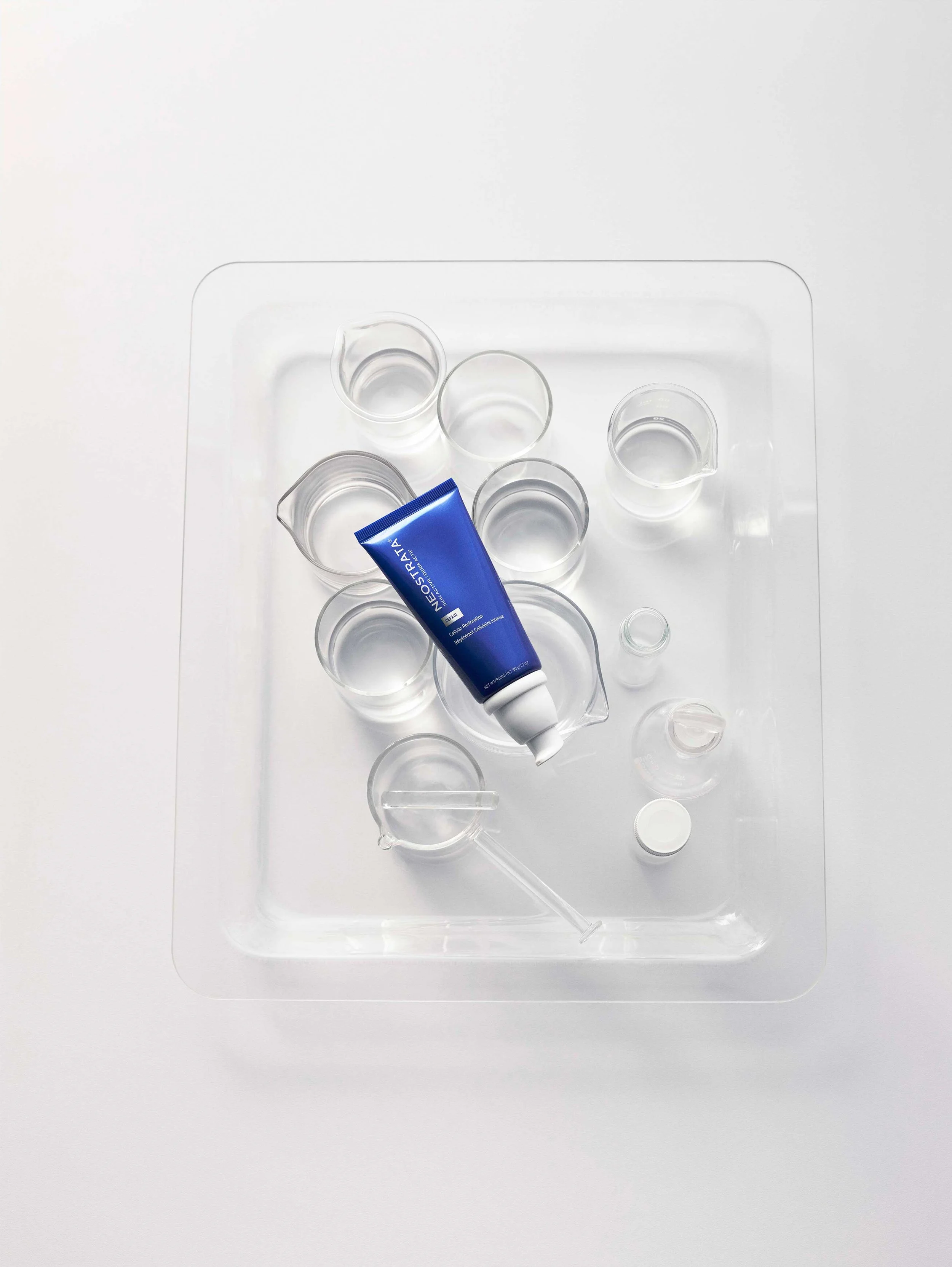
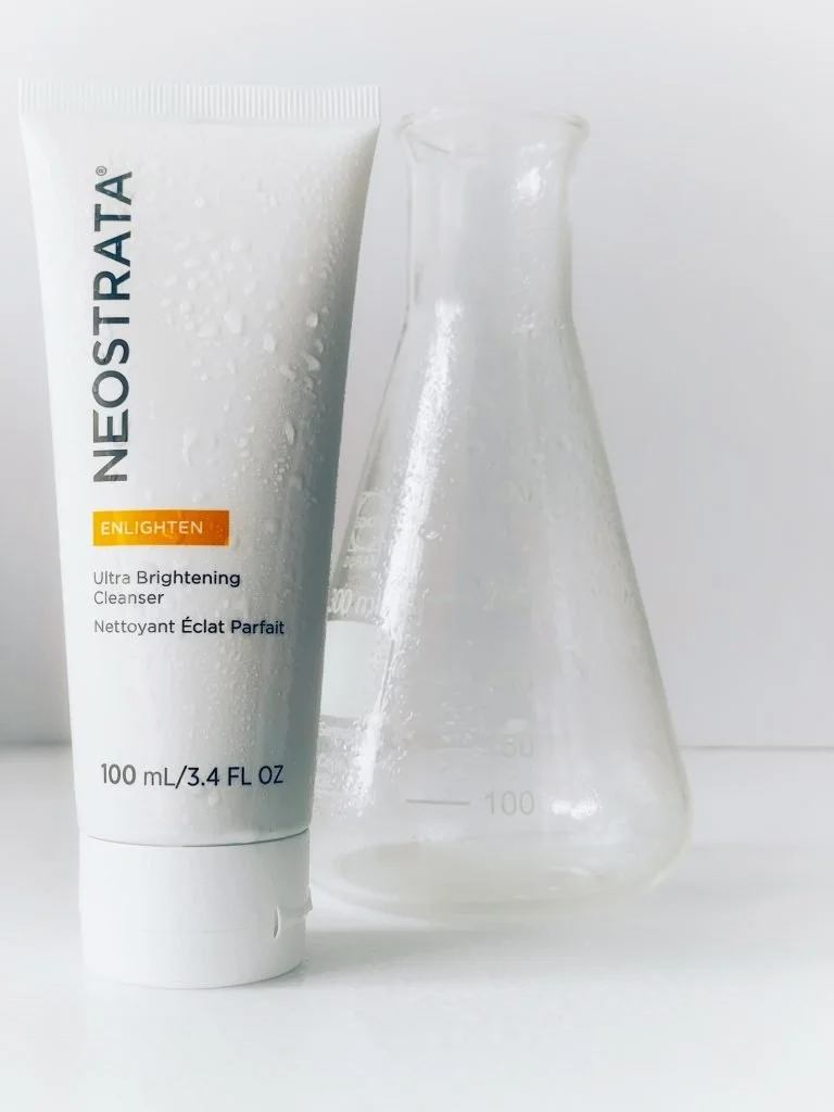
Enhanced Neostrata’s visual identity through custom photography. Hands-on in creating the photography direction, hiring the photographer and talent, on-set art direction, selecting final imagery, and overseeing post-production.
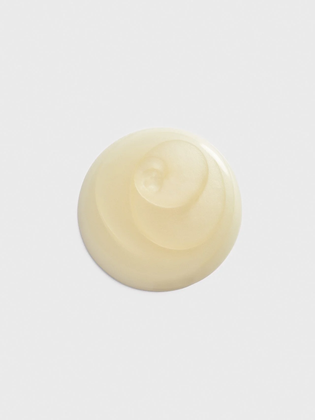
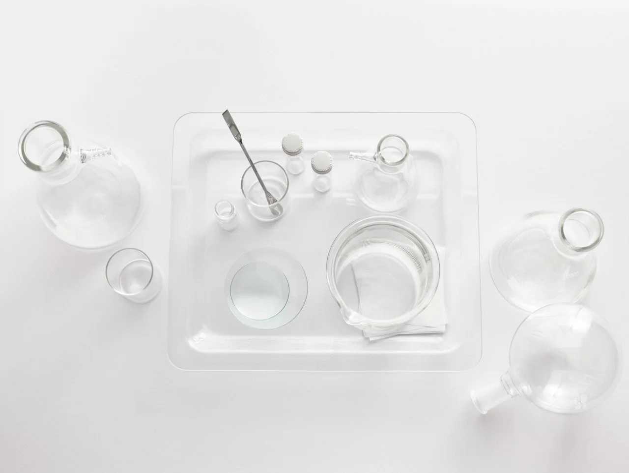
Effectively, doubled our achievable shotlist by creating compositions with chemistry lab glassware and then adding product to the shot.
Metrics
-
3 days of photoshoots
-
6 product textures, 10+ product shots, 10+ model shots, 1 model video
-
110+ patents from the Neostrata founders