REBRAND & PACKAGING
Honoring a Heritage of Precious Moments.
Established in 1894 with Maternity Kits, Johnson’s Baby is trusted for 130 years of leadership in the baby category.
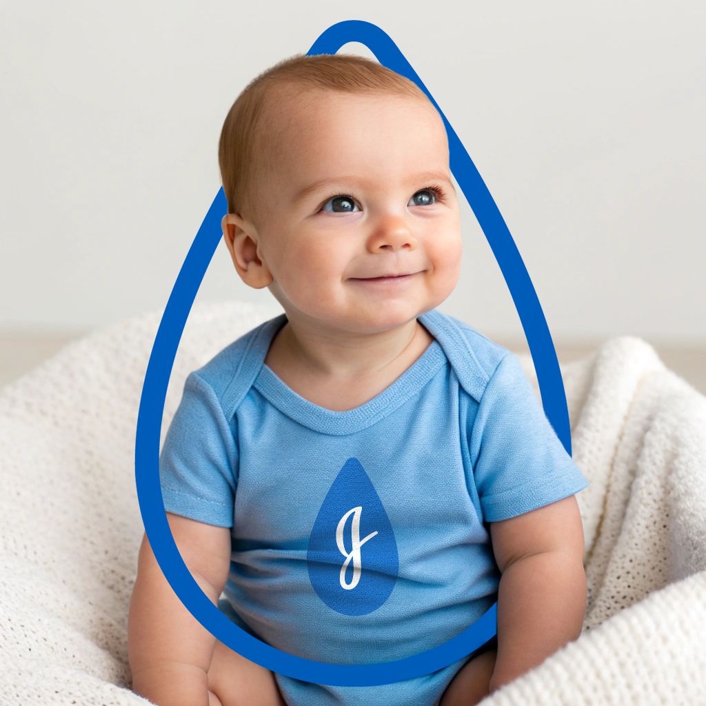
With pride, the brand is elevating it’s heritage of firsts— 1st baby brand, #1 hospital recommended, world’s #1 baby & child care brand. Johnson’s is taking back “baby” in the logo lockup to capture what’s instinctively precious to the brand— that first bath time and those first moments at home with baby.
Concept Development, Packaging Design, Qual & Quant Testing, Color Development, Brand Architecture, Brand Strategy, Brand Equity, Logo, Cross-Functional Collaboration, Agency Oversight


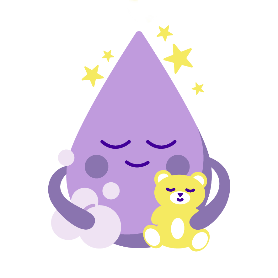
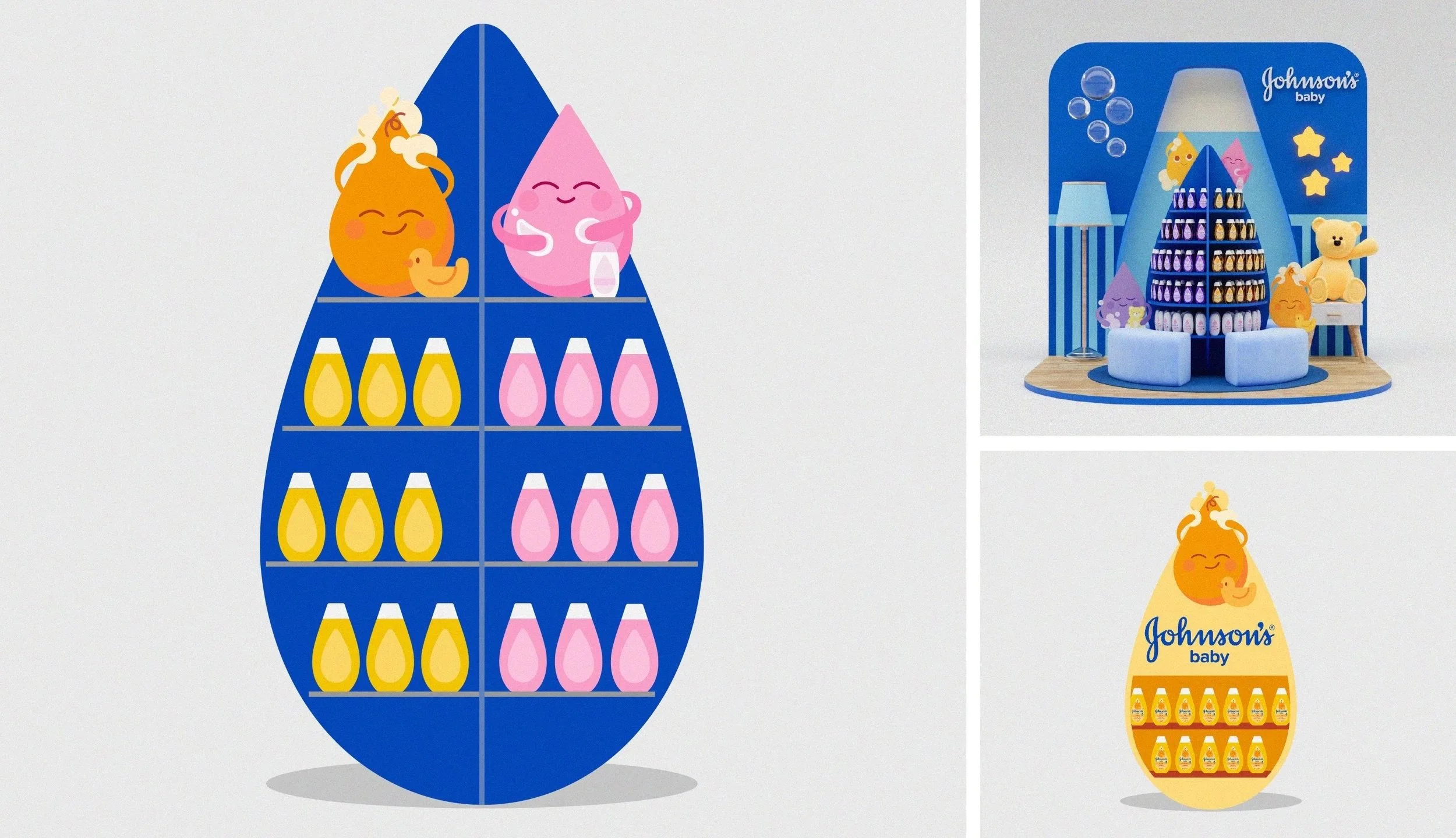
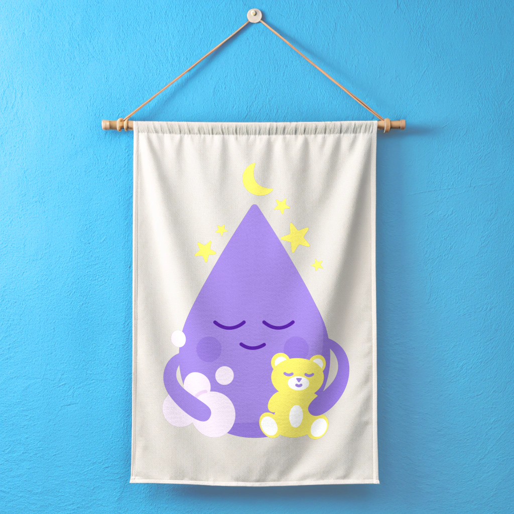
Logo Lockup • Label Hierarchy • Color Contrast • Drop Character • Brand Architecture
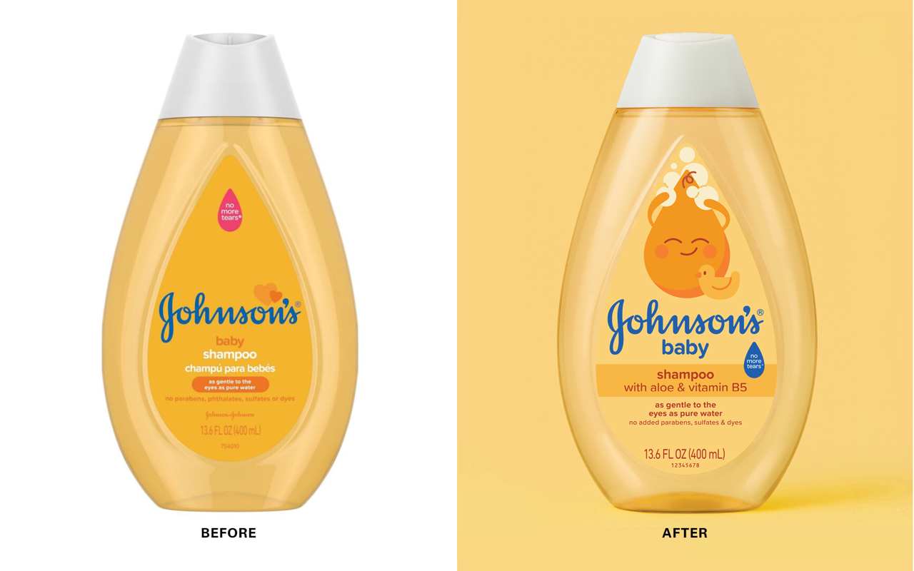
Taking ownership of the iconic drop shape, we created adorable characters across product formats, bringing to life the emotional benefits and filling bath time with love, trust, and tenderness. Johnson’s Baby products deepen the profound emotional connection between a baby and their caregiver. The new brand imagery showcases these precious moments.
Packaging & Characters
2+ year process
Metrics
-
63 global characters + color combos created
-
1 internal design team; 2 agency partners; 2 innovation marketing leads; 2 equity marketing leads
-
16 concepts created; 4 rounds of consumer testing
-
114 Global Design Intents Released across NA, LATAM, APAC, Canada, EMEA
Brand Equity & Key Visuals